We turned in our full body portraits today and it was very neat to see all of the different poses and styles that people did. I loved seeing the weird-colored skin: green and purple. There were also people who drew the back of themselves and them bending over which was quite unique. I got a lot of compliments on my style for the piece. It wasn’t as unique as others, but I did it all in black/gray markers.
Critique #8
I quickly noticed that with charcoal, all of the pieces were very dark. A lot of people needed this as there seem to be a lot of light handed people in this class. I got some nice compliments on my piece, specifically the hair straightener and all of the shadows. However, I completely forgot we had to have some type of cloth in our piece, so I didn’t incorporate that. Hoping I don’t get too much taken off for it.
Critique #7
For this critique, we talked about our first ink homework assignment. I noticed it was a common theme for most people to have to darken their values a bit more. This was the case with my piece as well. People really complemented the paper bag I drew and said the texture was very well done. I really enjoyed Mae’s piece. It was payed out in a very cute way and her style with the thick black lines was very nice to look at.
Critique #6
So, we each did a drawing a medium-sized object. We drew this object three times under different lighting. Some pieces were terrific. I really loved the precision, accuracy, and detail of the drawing of the metallic cup. Some pieces, however, looked as if they just drew the piece the same three times. They didn’t show enough of the lighting change. When it came to my piece, I was super happy with how it turned out. No one said anything negative about my piece. A few big things said about my piece is that the shadows look very accurate, I did well making the shadows very dark, and I did well showing the highlights. It was very nice to hear these compliments and I will be sure to continue using the same technique.
Critique #4
I’m a little nervous for my grade on this piece. I’m not certain, but I think I may have followed the instructions incorrectly. I think I was supposed to draw a space, but I really just drew some food boxes I had. This drawing was fairly easy for me and it was a bit simple which I may get points taken off for. I tried to add details such as logos and what-not, but it’s still a rather simple drawing as a few said during our critique. People did say they were very well done in that the lines are straight, and the perspective looks correct.
Critique #3
So, we didn’t have an actual critique for this assignment, so I’ll just tell you my opinions. I really think I did a good job making straight lines that are parallel to the sides of the paper. I’ve really been trying to work on my line variation because I’ve always noticed something written about that on the back of my homework. I really think I did a pretty good job with line variation in this piece. My biggest critique to myself is that my lines aren’t very clean. Because I was making such long, straight lines, I had to correct my line a lot which created fairly sloppy lines.
Critique #2
I felt like a lot of talent was shone in this critique. Many people who had issues with line darkness in the first critique fixed it this time around which increased their drawings dramatically. I got some nice compliments on my piece. People said everything looked very proportionate and had the correct angle. I was criticized on my line variation which is something I can never get right. I promise, I try. I feel like I did a bit better on this one, but it still wasn’t quite right. I got one critique on the position of the ladder, that it should be moved to one side or the other. I personally liked where it was at, but to each their own.
Critique #1
I love the excitement of having a critique in a new class with new people. All of the styles and pieces are so fresh to me. Many of the pieces were great. There was one piece, I believe it was Mae’s, that really stood out to me. The lines were all very a very good weight. She did a great job of using line to show how float the pieces of fabric in her piece was, and the perspective and proportions looked very accurate. I felt that all of the comments on my piece were very positive. People said I did a great job with perspective, line cleanness, and provides good background lines.
2d Final Analysis
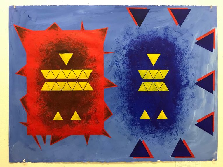 My art piece is paint on 22″ x 30″ piece of stonehenge. The background color is a mid-tone blue. To the left is a big, spike-y, red rectangle. Inside it are yellow triangles, seeming to form the shape of an abstract person. to the right is another abstract, yellow person with red and blue triangles all around them. The point of this piece is to represent what people, most often women, see when they look at themselves in the mirror. The body to the left is much larger than the one to the right. It is in a spike-y rectangle which is the mirror. The figure to the right shows the reality of the situation. The red and blue triangles around this abstract being is all of the outside influences on their body image issues.
