Final Project
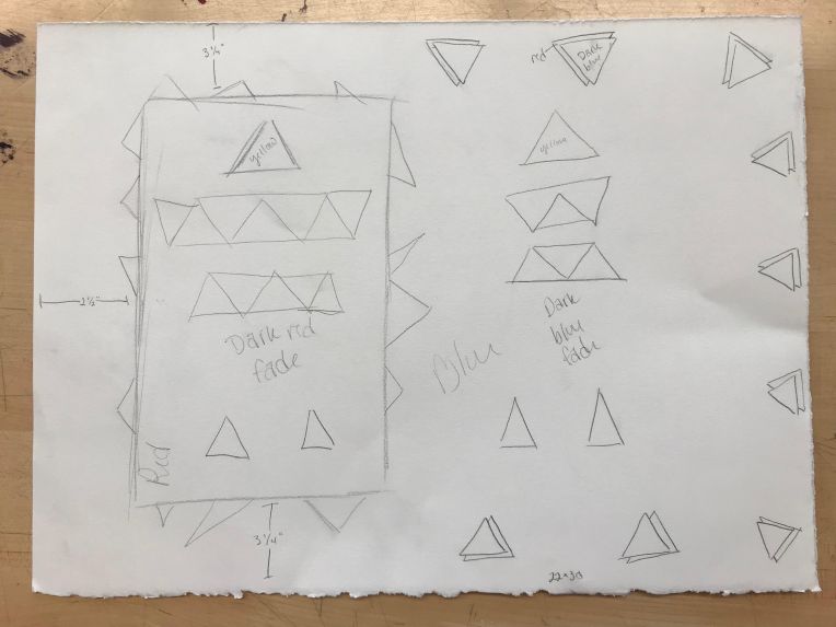
Above is the rough sketch of my final 2D Composition project. The final piece will be created on a 22″ x 30″. As for colors, I will be focusing on using primary colors: red, yellow, and blue. The background will be all blue. If the piece at the end looks a bit empty, I’ll probably add some red paint drips and swipes to the background. The large, spike-y rectangle to the left will be colored red and fade into darker red as it gets to the center. The triangles inside that rectangle and to the right of the rectangle will all be colored yellow. Underneath the rectangles to the right, I plan to fade that into a darker blue. The full triangles around the edges on the right will also be painted blue, but they will be dark blue instead of the lighter background blue. The little sliver of double triangle underneath will be colored red. I plan on using painters tape to perfect the straight edges of each object. As for materials, I will use a large piece of Stonehenge, various colors of paint, and possibly some tissue paper if I think it needs a little extra pizzazz in the end.
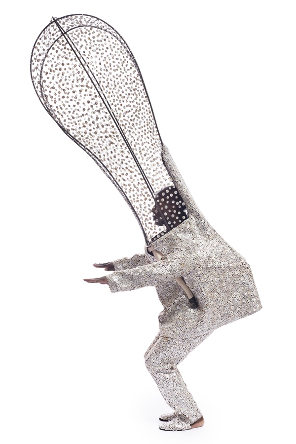
Nick Cave
Nick Cave is a very unique artist. He works to create costumes which he calls “soundsuits” which obscures gender, race, and class. These suits are made from various miscellaneous materials such as beads, stuffed animals, toys, and flowers. He displays these suits on mannequins which he puts in quite powerful stances. It’s also quite common for him to put these suits on actual people, or even himself, and perform a dance for the audience. He describes these soundsuits as sort of being symbolic for power and standing up for what you believe in.
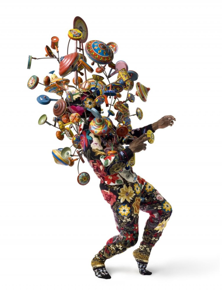
I will be honest with you, this man has hundreds of these things and I’m really struggling to find the names of these pieces, so, for my purpose, they shall be nameless. This first piece is definitely my favorite of the ones I have seen. The man looks to be wearing a floral onesie. On the upper half of his body is a structure of bars connecting old kids toys. The piece, to me, is quite creepy looking. It makes me think of a abandoned amusement park. I have always been very fascinated with those, hence why I am drawn to this piece.
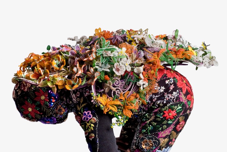
This piece has another floral onesie, but this time the focal point is on the back. Hundreds of what looks like knitted flowers are scattered all along the backside. Being that the knitted flowers look quite realistic compared to the pattern on the onesie, this piece is a very neat blend of both artificial beauty and natural beauty. This piece really jumped out to me because of its intricacy and clashing colors.
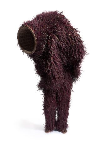
This piece makes me feel all warm and fuzzy, probably because the piece itself is warm and fuzzy. It’s kind of like a creepy take on a teddy bear. The large whole in it’s head makes me feel as if we are looking into his head and he is putting who he is on display for us.
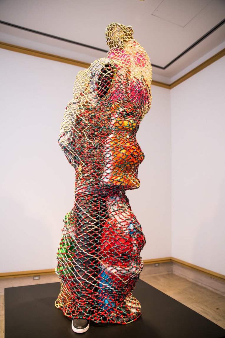
The colors of this piece really stood out to me. Initially, I felt this piece was resembling someone being trapped or restricted, but after thinking more about all of the warm and happy colors, it made me think that maybe this is a happy entrapment. This person is surrounded and protected by loved ones, or, on the other hand. maybe the loved ones are restricting this person
The style of this piece really stood out to me. I love all of the white, small bits of black, and see-through top half. The elements of this piece come together as someone being upfront and honest with you. They are being “black and white” as some might say. The see-through head piece is also suggesting we see right into this persons head. We know exactly what their thoughts are and we know we can trust them.
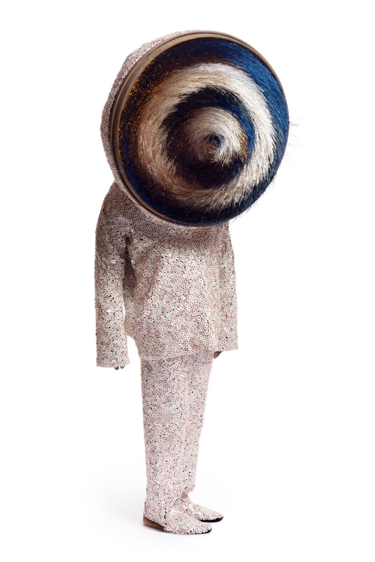
The clothing of this piece is very similar to the previous one, but instead of hints of black, the hint of color is more pink-ish. Unlike the last piece, this one feels very untrustworthy and unsettling. The head is hypnotic. It seems as if they are trying to persuade or pressure you into doing something.
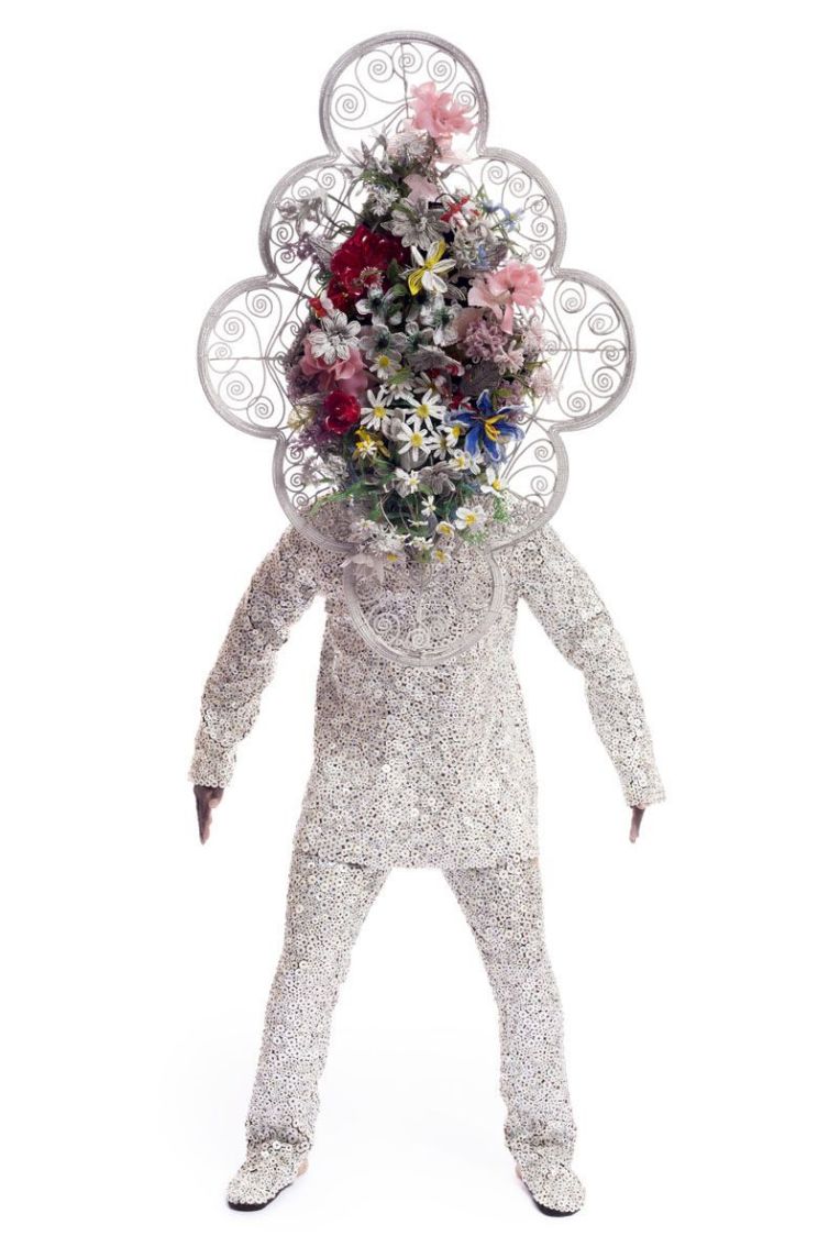
This piece really reminds me of a wedding with all of the white and flowers. It’s very intimidating with how the man is posed, however. I believe if he were posed differently, it would give off a much different feeling/meaning than it does in this position. He seems so forceful and, again, intimidating. Almost as if it is referencing the pressure that people feel to get married or maybe all of the scary things that come with marriage.
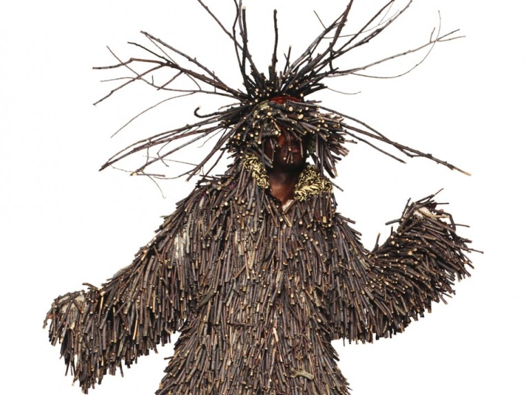
This piece really stood out to me for its unique materials. The man is covered in layers of sticks. It seems to me as if this is a sort of camouflage. This person is maybe hiding from something. Maybe it means they’re trying to blend in with their surroundings to not be noticed or picked on.
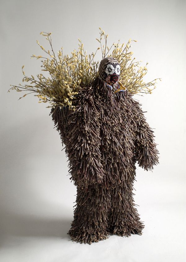
This piece, of course, gives off a similar vibe to the last piece. The main differences look to be that the sticks look more like fluffy fur, he’s growing weeds on his back, and he has a quite peculiar mask on. It almost as if he’s trying to blend in but parts of his true self keep coming through. They’re all people can focus on when they look at him.
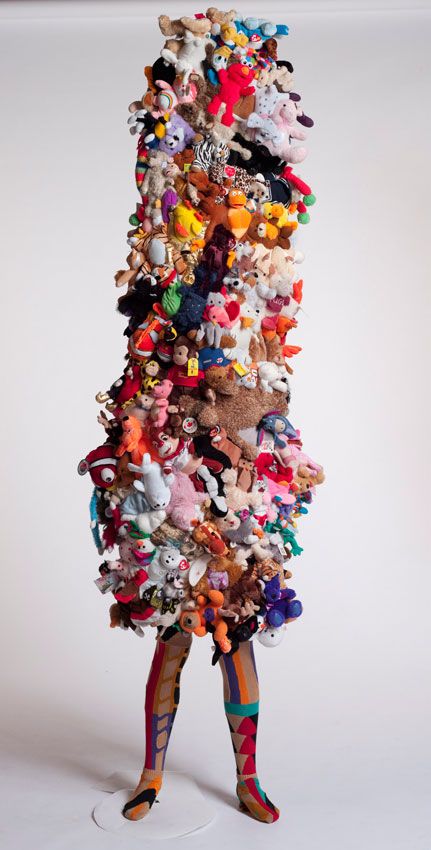
This piece seems so fun and playful. It’s made up of many different stuffed animals of all sizes and colors. Zebras, bears, ducks, pigs, fish, the whole zoo! This piece definitely takes me back to my days as a carefree child. Being a child, you’re protected from so many things and you don’t really realize it until you’re older. Elmo looks like he’s enjoying himself up there.
Critique #10
This was a very messy, but interesting experience. I have never drawn this way before, but it was very neat. There were so many good drawings. I was complimented a lot on mug and it’s reflections. I was critiqued on needing more detail in the background.
String Photos


Critique #9
I feel rather conflicted about this critique. I got a few good compliments and a few small critiques. I was complimented on the accuracy of the structure of all of my hands and feet, I was critiqued on one of my hands not having as much shading as the others. I, myself, think I could have made the shading much smoother than it was, but no one critiqued me on that.
Illusion of Space and Motion


Critique #8
Monday, we displayed our self-portraits. I was very proud of mine. A lot of people said they really liked mine and one even said “I wanted to kill my self when I saw that.” I did get told to push my darks a bit more, however. I will be sure to do that.
Critique #7
Monday we showed off our reflective drawings. Many of them were very impressive. I was impressed with myself on this. I picked a very difficult vase to draw, it had a weird texture. However, I was told that I did a very good job showing that texture. I was also complimented on the contrast of the piece, and my choice to lay the staple sideways instead of upright. I didn’t get any negative comments, but I do wish I had added more to my space, it just seemed a bit plain to me, compared to the others.
